
Who has the best Eliteserien strip this year? I took a look at all the home kits and rated them 1st to 16th
16 - Mjøndalen

Mjøndalen the only club with a brown strip of course, but for me it just isn't a nice strip.
 15 - Start
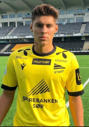
Really don't like this yellow effort from Start. The sponsors just don't really work for me and it is such a generic yellow colour that it just doesn't stand out.
 14 - Aalesund

Aalesund certainly stand out with this orange number, but it isn't for me. The collar is a bit boring, and I think it could have been a nicer shade of orange.
 13 - Odd

I'm normally a fan of a white kit, and a hummel kit, but this one just isn't doing it for me. Possibly the red sponsor is ruining it.
I do like the collar design, but I prefer other white strips in the league.
 12 - Haugesund

Another white effort, again probably ruined by the sponsor. I'm not a big fan of the collar either to be honest, not much in it between this and the Odd one.
 11 - Viking
Huge sponsor issues again, all over the place as well. I like the colour but not much else going for it.

10 - Stabæk
Dark and light stripes traditonally make a nice kit, but the shades in this one are just a bit wrong. Also the colour is a weird colour. It is a bit cleaner than the other kits though in fairness.
 9 - Strømsgodset

Nice colour and I like the stripes running through it. Not sure about the Kiwi logo in the middle of the chest, but apart from that, a solid strip.
 8 - Vålerenga

A really nice shade of blue and it goes well with the red on the collar and sleeve. Simple design, but it does work for me in this case.
 7 - Kristiansund

Again a nice colour and I do like the lines going across. Very similar to Godset, but I prefer the collar in this one and the lovely owl badge that KBK have.
 6 - Bodø/Glimt

It is just a much nicer yellow than the Start strip, and it is very clean with just yellow and black.
They also have that faded globe coming in at the bottom which I kind of like.
 5 - Brann

Very nice red effort from Brann this year. There is also some design on the sleeves that this picture doesn't quite do it justice.
Nothing fancy but nice and clean design, and a nice shade of red.
 4 - Rosenborg

The best of the white kits, probably helped by the adidas stripes. For me it is not as nice as last years kit, but it's still a nice strip that is nice and simple with the one main sponsor on the front and classic white and black design.
 3 - Sarpsborg
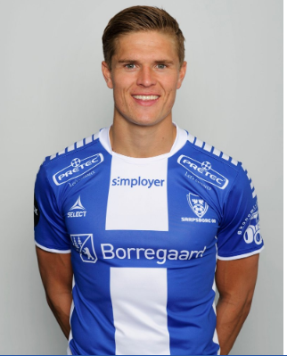
I really like this striped effort by Select for Sarpsborg this year. I like the shoulder design, and the slightly different collar. Wide stripes is good, the colours are nice and it all fits together very well.
2 - Molde

A really nice blue on the Molde strip this season, very simple design, much like the red Brann one. It's classic but it really works.
 1 - Sandefjord

Ok, I am not sure why but I just love this Sandefjord strip. A huge yellow sponsor, but somehow it works for me. It's a great shade of blue, the slightly darker lines running across it really bring it out. Then that white collar is majestic.
It probably shouldn't be my favourite but it just is, and the red and blue badge works well with the sponsors and strip too.
Probably not everyone's favourite, but it would be the one I'd go for this year to add to my collection.

Special mention to Molde for their away kit, which is the same design as the home, but they have absolutely nailed the colour on it, and it is beautiful.
No comments:
Post a Comment